Reporting and Kai Analysis
Kai answers two different reporting questions and keeps them on separate pages so neither muddies the other. Analytics tells you whether the machine is running and what is working. Kai Analysis is a weekly read on how Kai itself is improving over time. Both live under Reporting in the left navigation.
Analytics: Pipeline and Performance
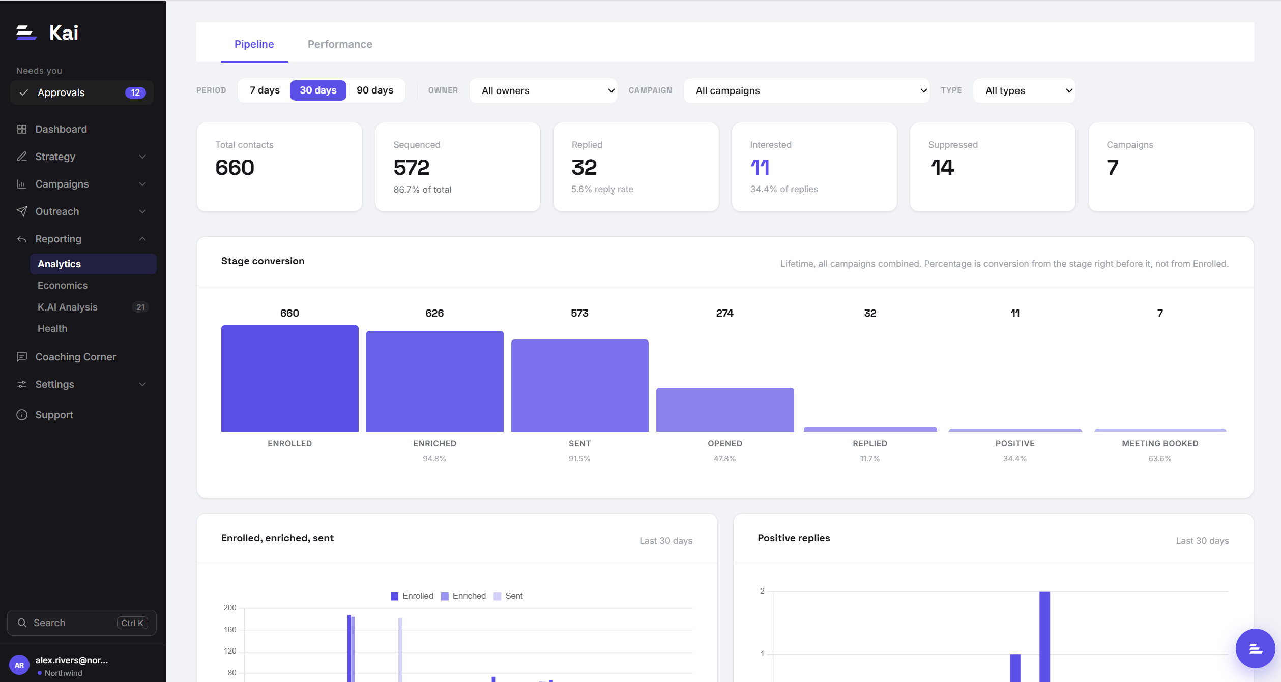
Analytics has two sub-tabs, because "is outreach flowing" and "what is working" are different questions and a single page answered neither well.
Pipeline
Pipeline answers: is the machine running. It shows stage conversion, volume, and rate trends across your outreach, counting activity regardless of how any individual sequence is structured. It is the health check: are contacts moving from research to approval to sent to replied at the rates you expect. As you add more campaigns everything averages together here, so Pipeline is most useful as an overall pulse rather than a way to compare campaigns.
Performance
Performance answers: what is working. It is comparative and gets more useful the more campaigns you run. You can cut results by rep, by vertical, by campaign type, and by outreach platform to see which combinations land. Because it compares like with like, it is where you go to decide what to do more of.
Why some rates are hidden
Counts always show. Rates, percentages like reply rate, are withheld until a touch has at least 20 sends behind it. This is deliberate: a "50% reply rate" off two sends reads like a signal when it is really just noise. Below the threshold you still see the raw counts, so nothing is hidden, but Kai will not show you a percentage it cannot stand behind. As volume builds, the rates appear on their own.
How reporting data is kept current
Reporting reflects activity as it happens in your outreach platform. When a contact is sent to, opens, clicks, or replies, that event flows into Kai and updates the numbers. Reply outcomes are attributed to the specific touch they followed, so Performance can tell you which touch earned the reply, across both email and LinkedIn. You do not need to refresh or sync anything manually.
Kai Analysis
Kai Analysis is a weekly, written read on how Kai is doing as a writer and how that is trending, aimed at RevOps and leadership. Where Analytics is about your pipeline, Kai Analysis is about Kai's own output and whether it is getting better. It runs on a schedule and the latest read is always on the page.
It focuses on a few trends over time:
- Reply and positive-reply rate for the sequences Kai writes, tracked over time so you can see the direction of travel.
- Edit rate before approval: how much reviewers change a sequence before approving it. A falling edit rate means Kai's first draft is landing closer to what you would send.
- Learning approval rate: as Kai proposes adjustments from what it observes, this tracks how many of those are accepted, a measure of whether its self-improvement is on target.
Reading the numbers well
A few habits keep reporting useful. Give a campaign enough volume before judging it; early cells are small and the hidden-rate guard exists for exactly that reason. Use Pipeline to catch a stall (contacts piling up at one stage), and use Performance to decide what to change (a touch type that consistently underperforms, a vertical that responds). Treat Kai Analysis as the slow signal: it is a weekly trend, not a live dashboard, and it is most telling read month over month.